
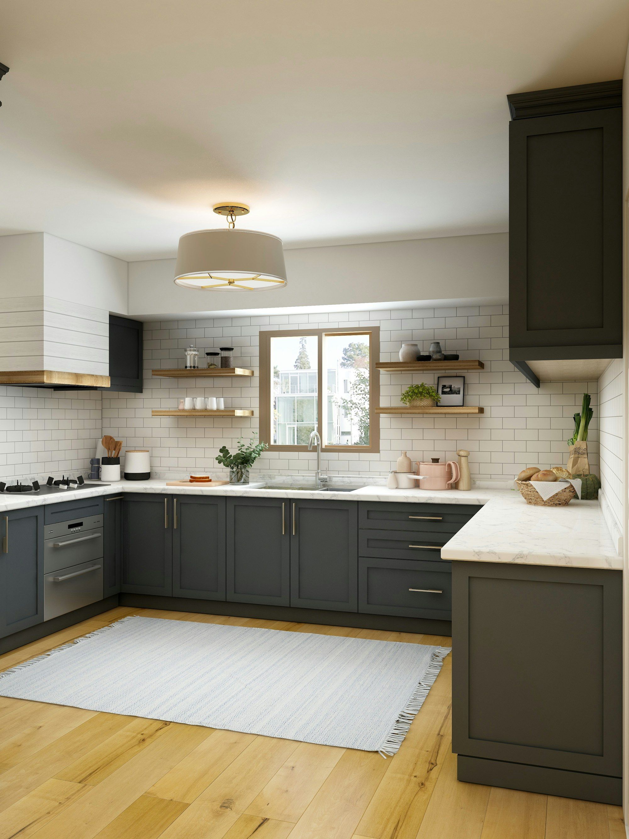
The page structure, photography, and trust signals that actually convert kitchen and bathroom website traffic, and the common mistakes worth cutting.
Written by Cristian Petrila, founder of Basil Studio Co
A kitchen or bathroom website that converts is built around a weeks-long comparison decision, not a five-minute purchase. That means real photography over stock imagery, one clear next step instead of five competing ones, and a site that loads fast on a phone, since a lot of this research happens on a commute, not at a desk.
Homeowners Are Comparison Shopping, Design for That
By the time someone lands on your site, they've likely already looked at two or three competitors. The website's job isn't just to describe what you do; it's to give that specific visitor a reason to pick you over the tab they had open five minutes ago. Generic "quality kitchens since 1995" copy doesn't do that. Specific proof does: named materials, real timelines, actual completed project counts.
Real Photography Beats Everything Else
This is the single biggest gap on most kitchen and bathroom websites, and homeowners can spot a stock photo from a mile off. A gallery of your own finished installations, even if the photography isn't studio-perfect, outperforms a beautifully lit stock image of a kitchen you've never actually built. If professional photography isn't in budget yet, well-lit phone photos of real projects still beat generic stock every time.
The Page Structure That Actually Works
- Category pages for each style or range, not one generic "our kitchens" page trying to cover everything at once.
- Location pages for each area served, if you cover more than one town or postcode area.
- One clear call to action, book a showroom visit or request a quote, repeated consistently rather than competing with three other buttons on the same page.
- A dedicated gallery or portfolio section, organised by style or room type so a visitor can quickly find examples similar to what they're picturing for their own home.
Mobile Speed Matters More Than You Think
A meaningful share of the research phase for this category happens on a phone, often in short bursts. A slow-loading gallery page loses people before they've even seen the photos that were supposed to win them over. Compress images properly and keep the page lean; this is a technical detail with a very direct effect on enquiries, and it's often invisible to the business itself since the person checking the site on a fast office wifi connection never experiences the lag a mobile visitor does.
Trust Signals Above the Fold
A review count, a number of completed projects, or a recognisable local landmark near the showroom, placed where a visitor sees it immediately, does more to earn attention than any amount of copy further down the page. Don't make people scroll to find a reason to trust you.
What to Cut From Most Kitchen and Bathroom Websites
- Long contact forms. Name, phone, postcode, and a rough budget range is usually enough. Every extra field is a reason to abandon it.
- A generic stock-photo hero image. It sets the wrong first impression before anyone reads a word of copy.
- Reviews buried at the bottom of the page. If they exist, they should be doing work higher up the page, not hiding where nobody scrolls.
- Autoplaying video or heavy animation. It slows the page down for exactly the audience (mobile, on the move) that's least tolerant of a sluggish load.
A Quick Self-Audit
Four quick checks worth running today
| Question | If the answer is no... |
|---|---|
| Does the homepage show real, named projects within the first screen? | Add real photography above the fold before anything else |
| Is there exactly one primary call to action per page? | Remove or demote competing buttons |
| Does the site load in under 3 seconds on a phone? | Compress images and check for unnecessary scripts |
| Can a visitor see a review or project count without scrolling? | Move a trust signal higher up the page |
What Actually Slows Down a Kitchen and Bathroom Website
Unoptimised, oversized photography is by far the most common culprit, since this category relies so heavily on imagery. A single uncompressed gallery photo can be several megabytes; a gallery of thirty such images turns a page load into a genuine wait on mobile data. Compressing images properly, and loading below-the-fold gallery images only as the visitor scrolls to them, fixes most of this without sacrificing photo quality.
Designing the Enquiry Form Itself
- Ask for a postcode, not a full address. It's enough to judge whether the enquiry is in the service area, and it's a smaller ask than a full address up front.
- Make the budget range field optional, not required. Some homeowners genuinely don't know yet, and a required field they can't honestly answer is a reason to abandon the form.
- Confirm what happens next, immediately after submission. "We'll call you within one working day" sets an expectation and reduces the anxious feeling of sending an enquiry into the void.
Testing Changes Rather Than Guessing
Once there's enough traffic to make it meaningful, testing one change at a time, a different headline, a repositioned call to action, and comparing enquiry rates before and after, beats redesigning the whole site based on a hunch. Most kitchen and bathroom sites don't have huge traffic volumes, so tests need to run longer than they would for a high-traffic e-commerce site, but the discipline of measuring rather than assuming still applies.
What a Strong Kitchen and Bathroom Website Actually Costs
Costs vary by scope and existing content quality
| Scope | Realistic cost range |
|---|---|
| A properly built single-showroom site | £2,000-£5,000 |
| A multi-location site with location pages | £4,000-£10,000, depending on number of areas |
| Ongoing maintenance and content updates | £100-£400 a month |
Accessibility Is Part of Conversion, Not a Separate Concern
Sufficient colour contrast, readable font sizes, and forms that work properly with a keyboard aren't just compliance boxes to tick; they directly affect how many visitors can actually use the site at all. A meaningful share of any audience has some form of visual or motor impairment, and a site that's hard for them to use is quietly turning away enquiries the business never even knows it lost.
If you'd rather have this built and run for you end to end, see what marketing for kitchen and bathroom companies looks like as a done-for-you service.
Frequently asked questions
Stock photography instead of real installations. Homeowners comparison shopping this category can spot a stock photo immediately, and it undermines trust before they've read a word of copy.
One, repeated consistently: book a showroom visit or request a quote. Multiple competing buttons split attention and reduce conversions rather than improving them.
Yes, especially on mobile. A meaningful share of research happens on a phone in short bursts, and a slow gallery page loses visitors before they see the photography that was meant to win them over.
Yes. One generic page trying to cover every style dilutes the message for each specific buyer. Separate category pages let the photography and copy match what that particular visitor is actually looking for.
Professional photography helps, but well-lit phone photos of real, completed projects still beat generic stock imagery every time. Authenticity matters more than production polish in this category.
Get new posts by email
One email when something new goes up. No sequence, no drip campaign.
Want help applying this to your business?
Book thirty minutes below and I'll tell you honestly whether this is worth taking further.